The Big Indie
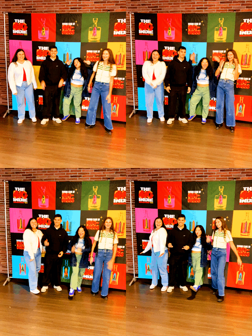
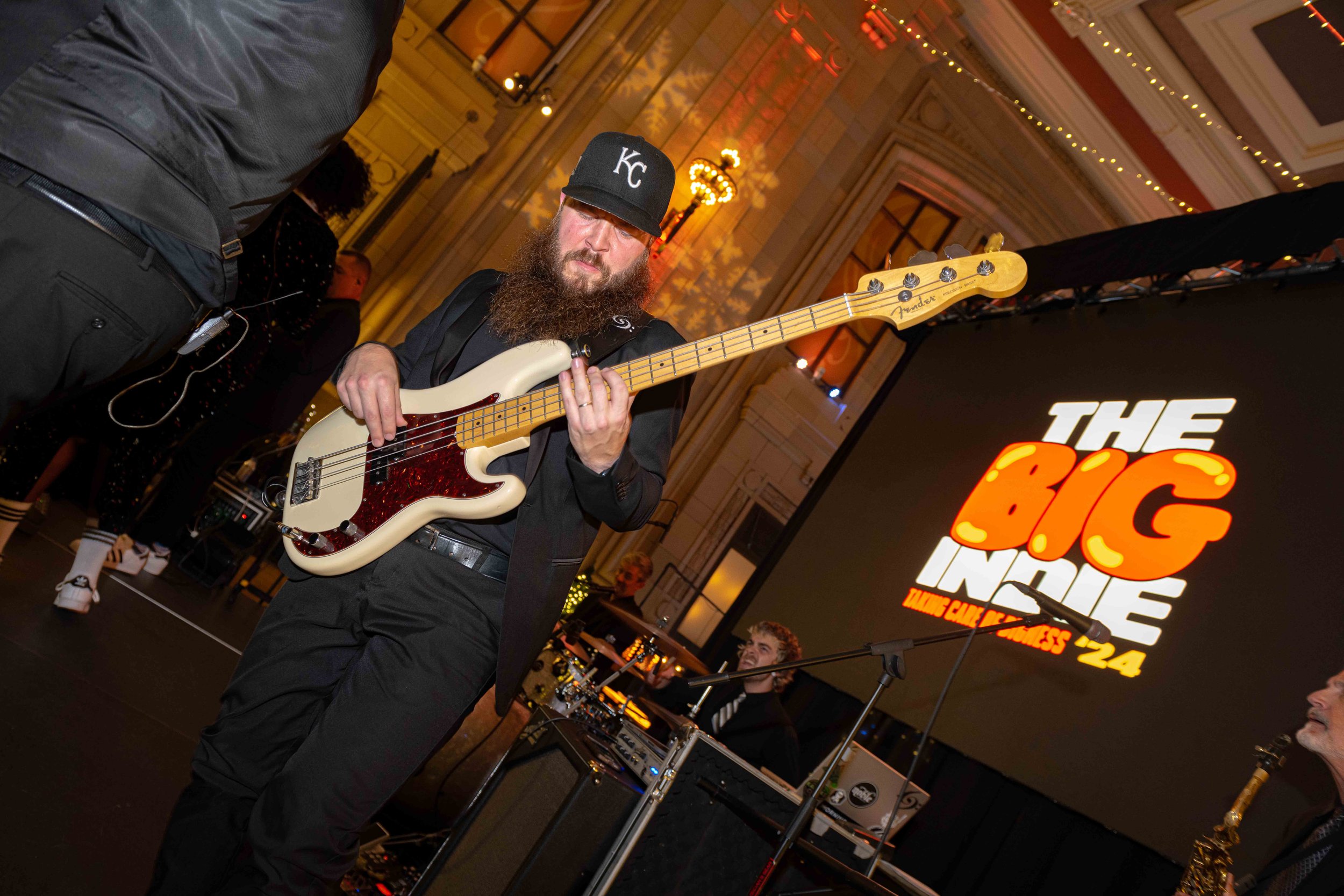
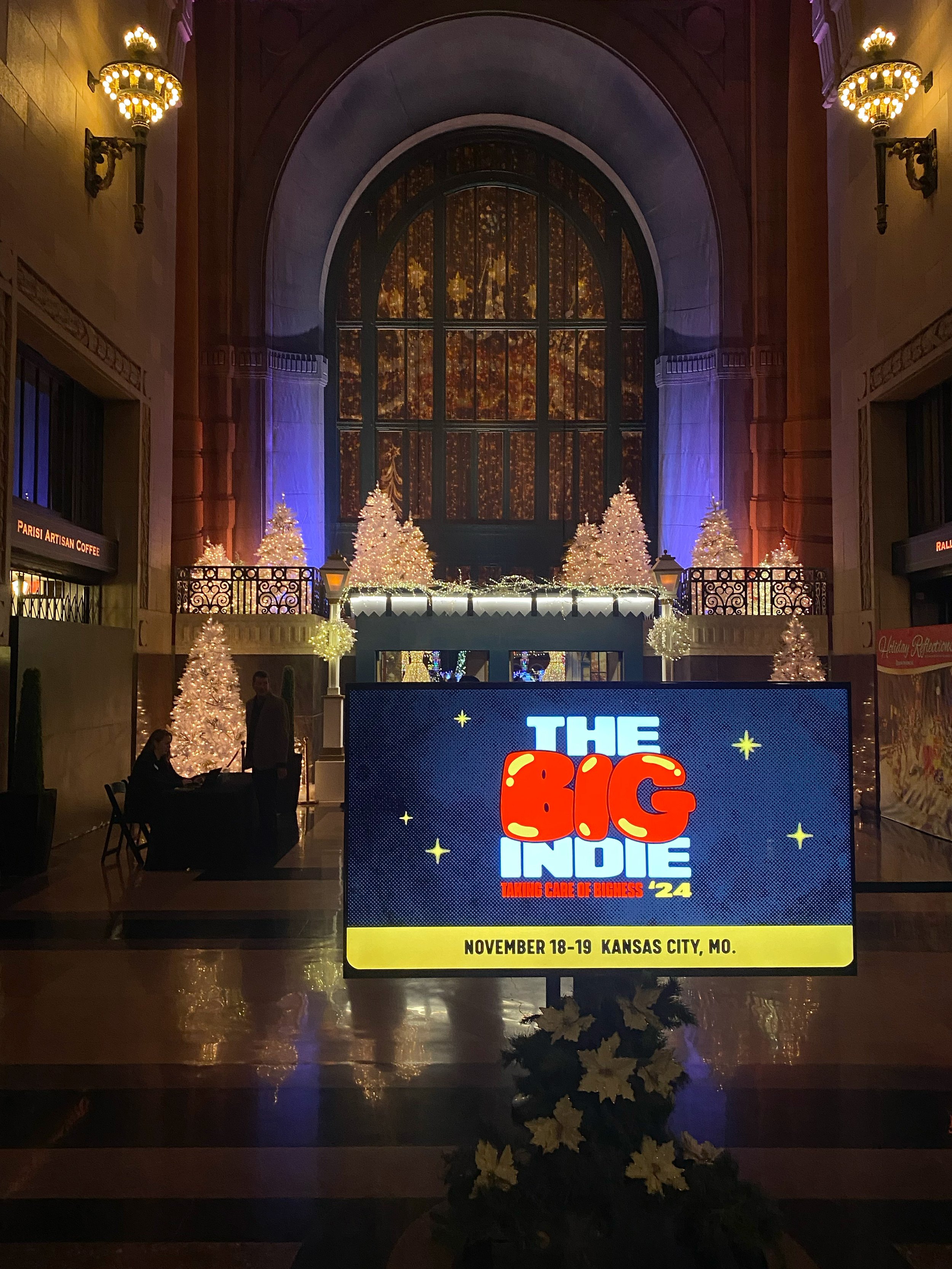
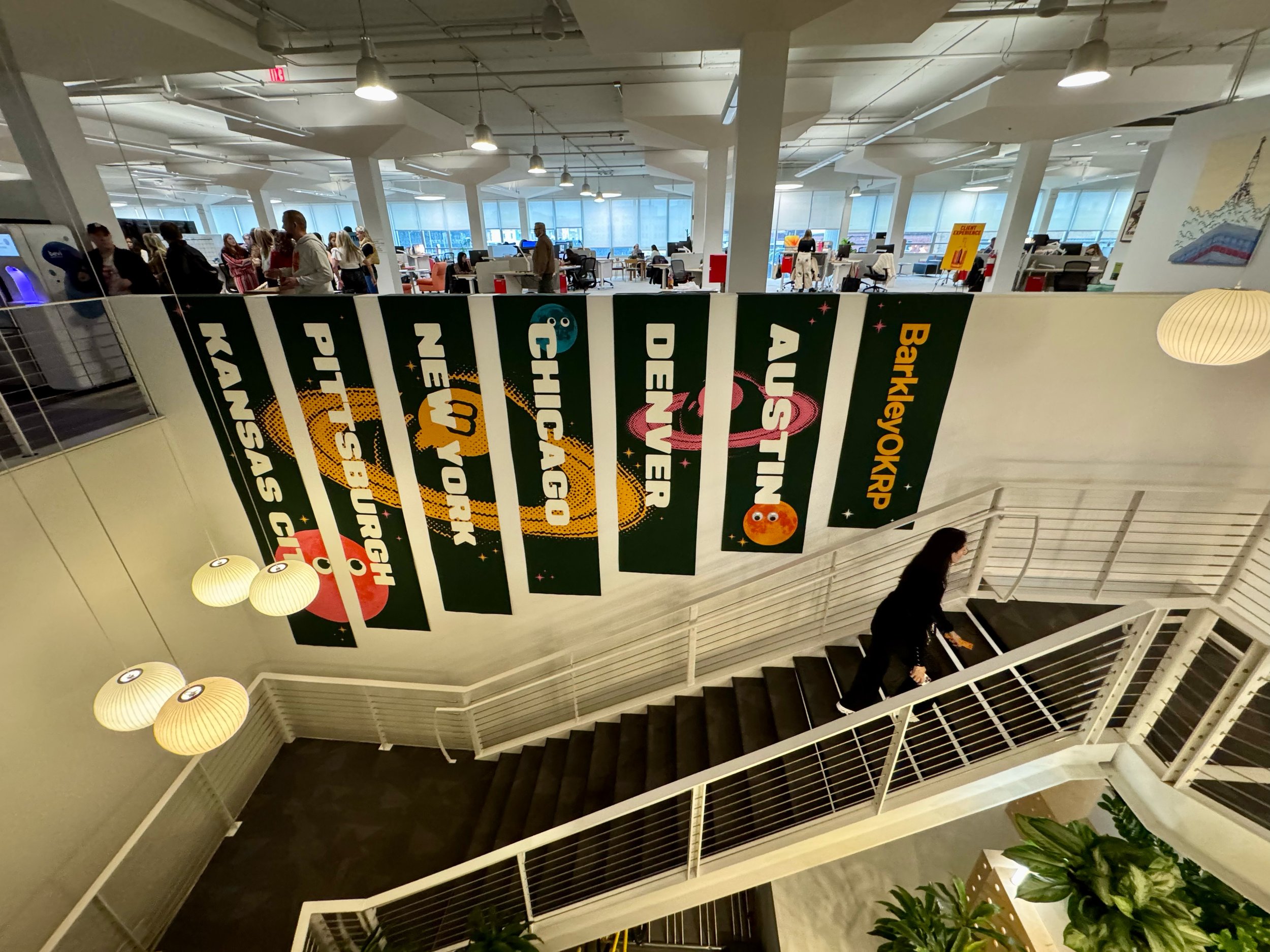
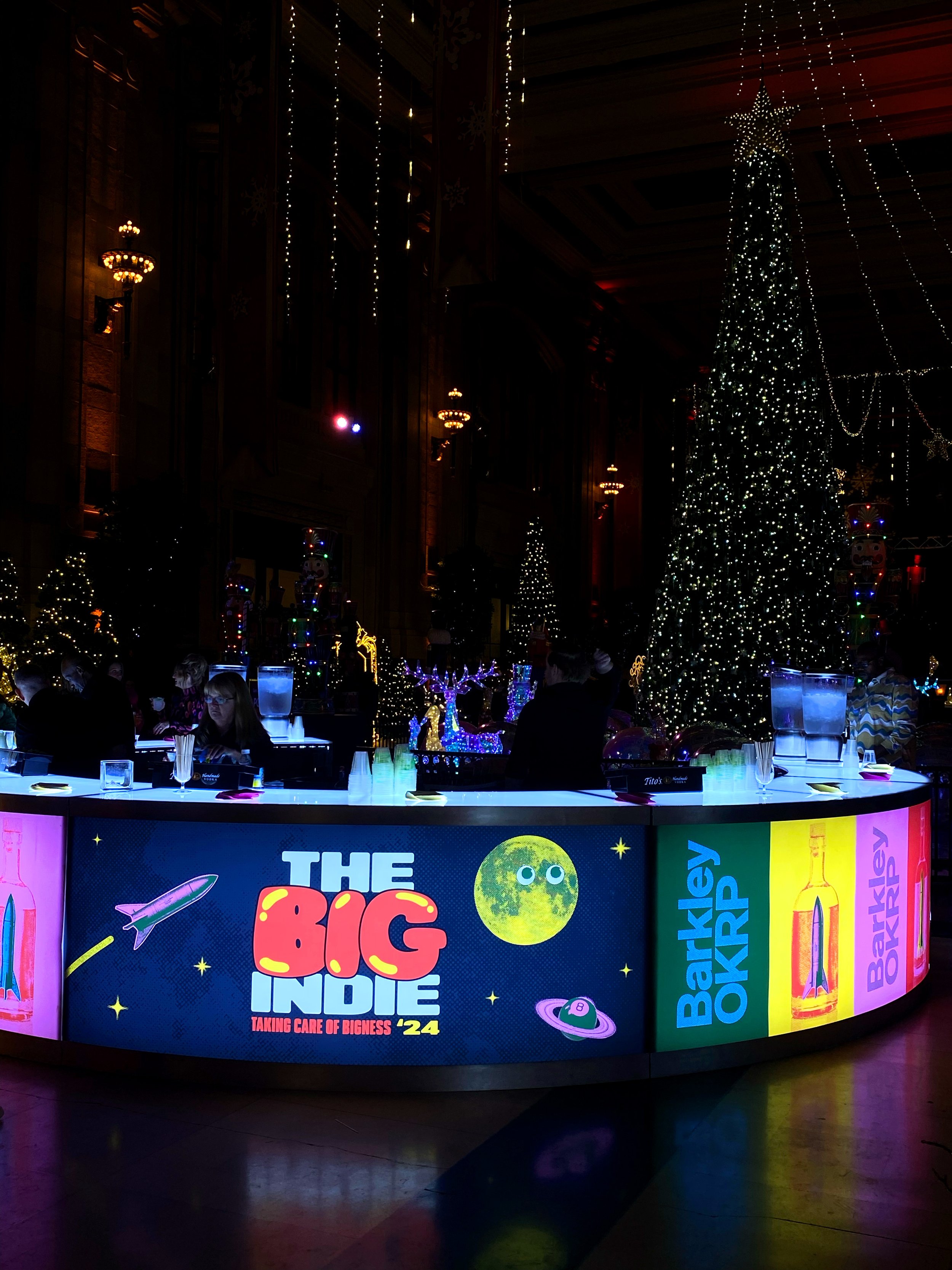
The merge of a few companies to form a big super agency - with the client focus of a start-up and the capes of a global go-getter. The result: a new model, consumer-first agency, so big yet so independent, it could only be called: The Big Indie. Here is the branding for the first-ever all-agency in-person two-day event.
-
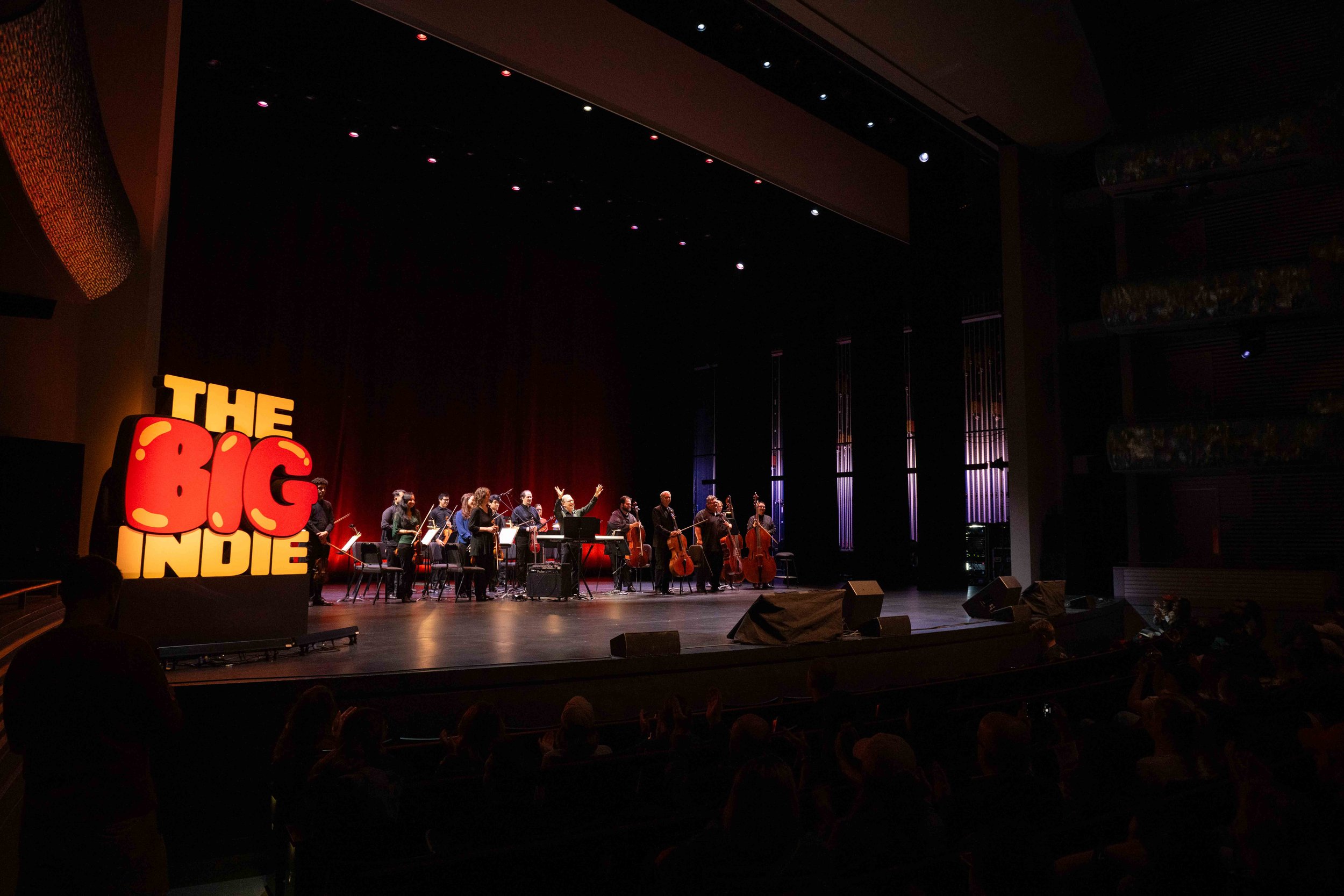
Develop a design system and tone of voice for BarkleyOKRP's first-ever all-agency in-person meeting. The event's vision needed to align with the theme "The Big Indie" and inspire excitement among employees about the new, unified agency.
-
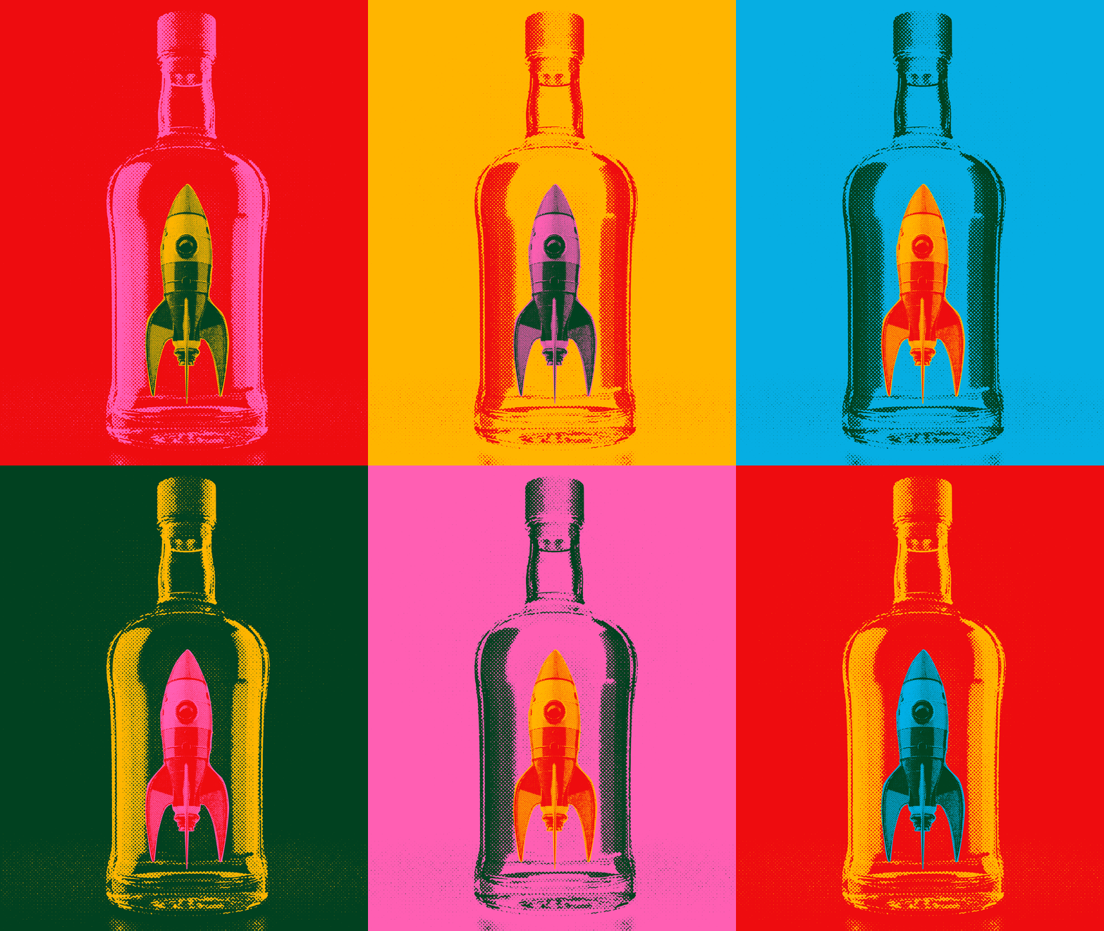
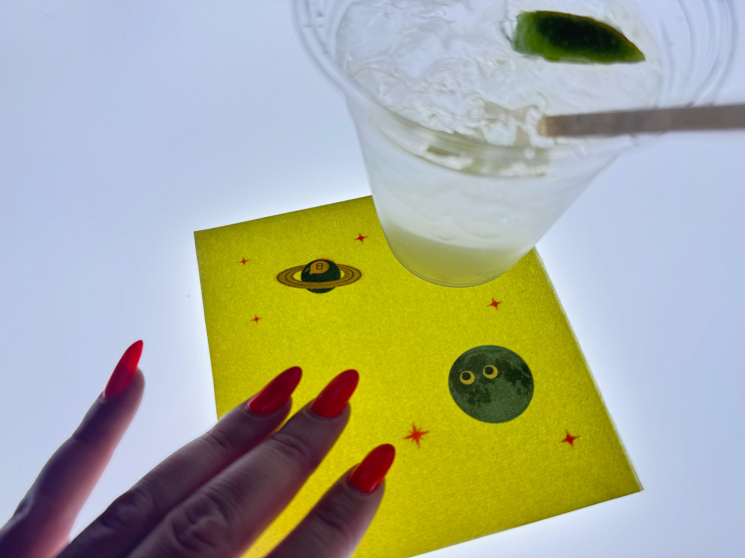
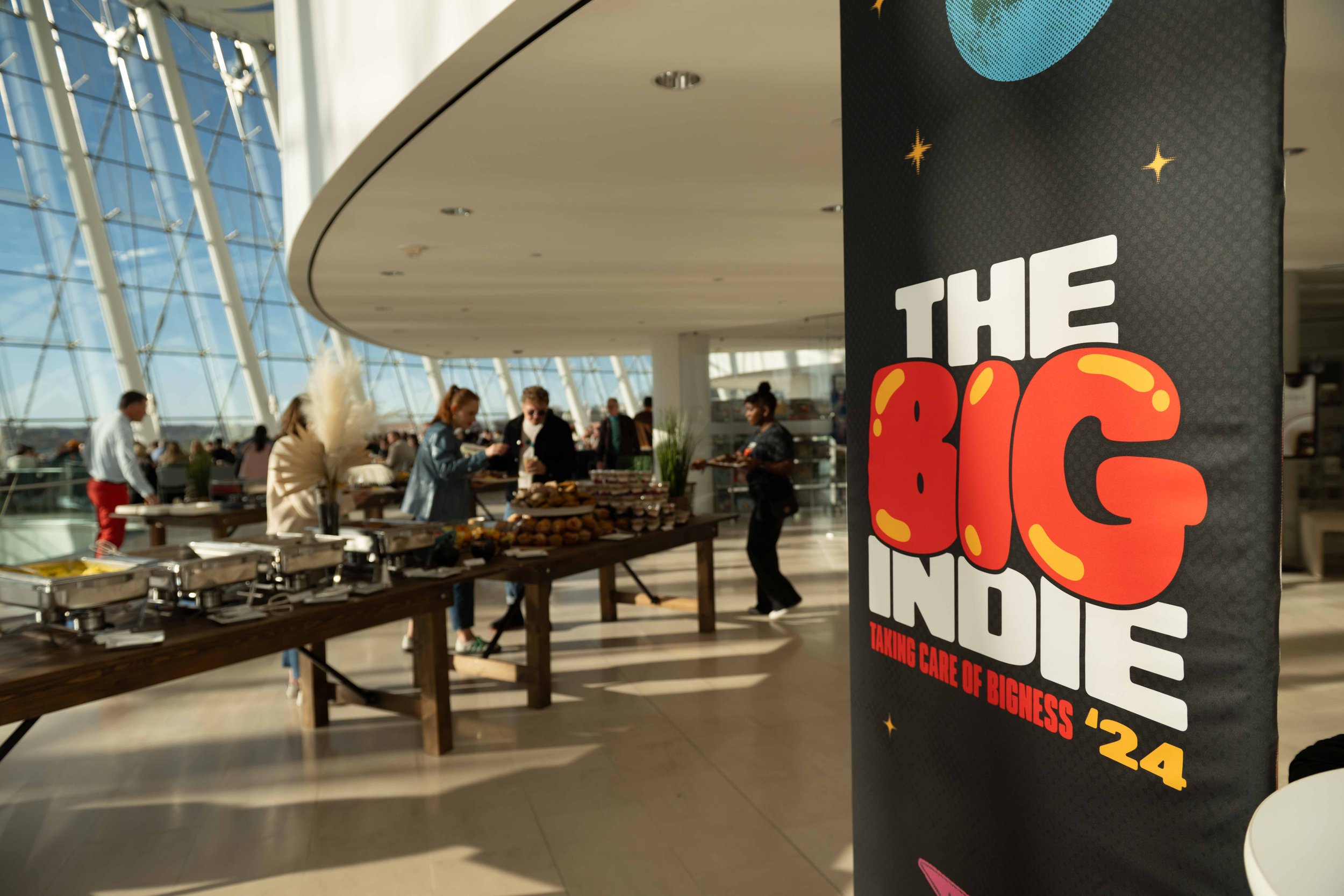
A vibrant and bold design system that seamlessly blends BarkleyOKRP’s legacy with its fresh ideals and iconography. The new principles—honest, audacious, and a little off—are reflected in the imagery, featuring unexpected fusions of two elements with a playful and surprising twist.
Incorporating halftone textures to evoke a sense of Midwestern grit, combined with futuristic graphic elements, creates a perfect balance of tradition and forward-thinking. This approach reflects the company's roots while symbolizing its vision for the future.
-
Design: Margaret Kots, Adrian Gilling, Paul Corrigan

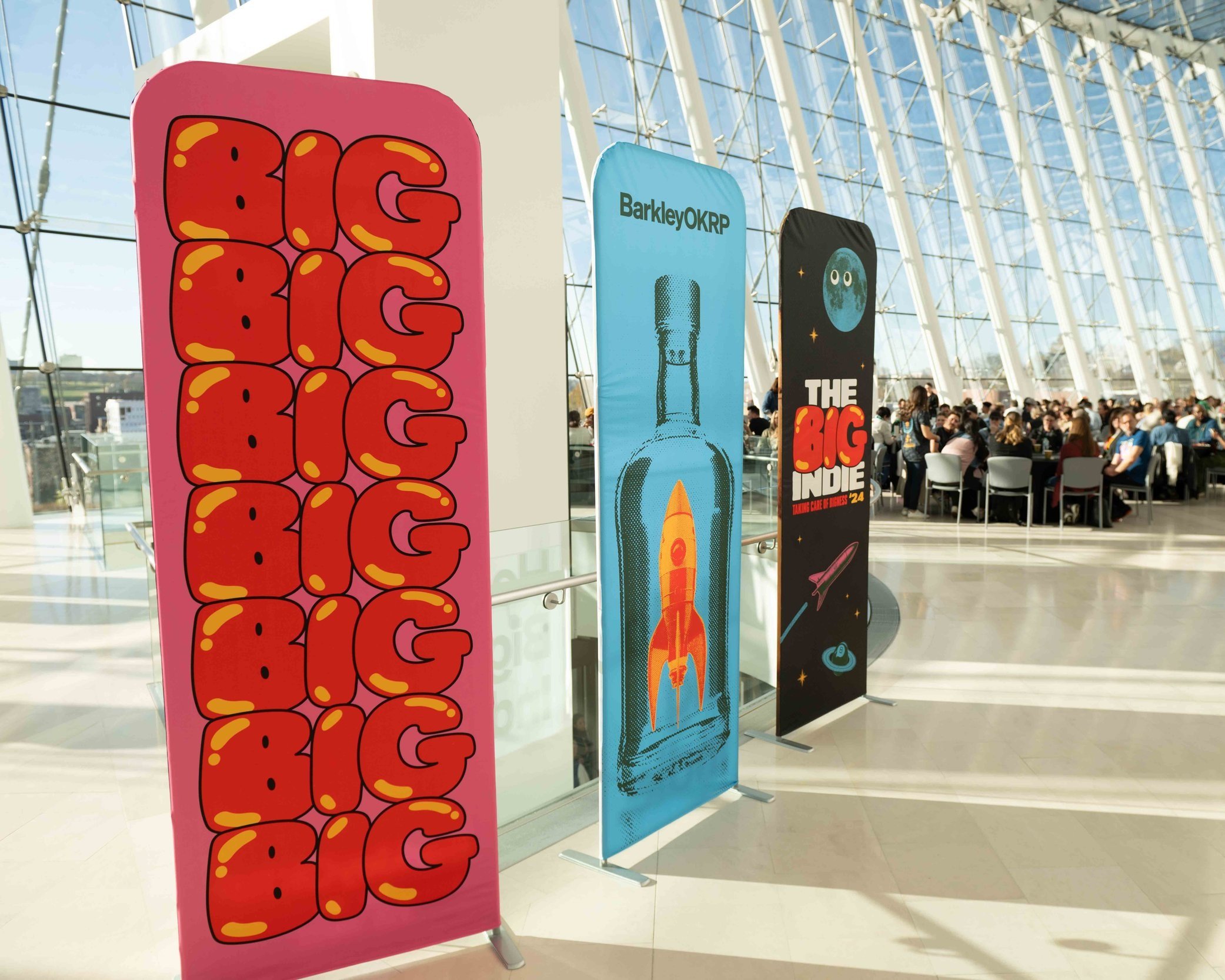
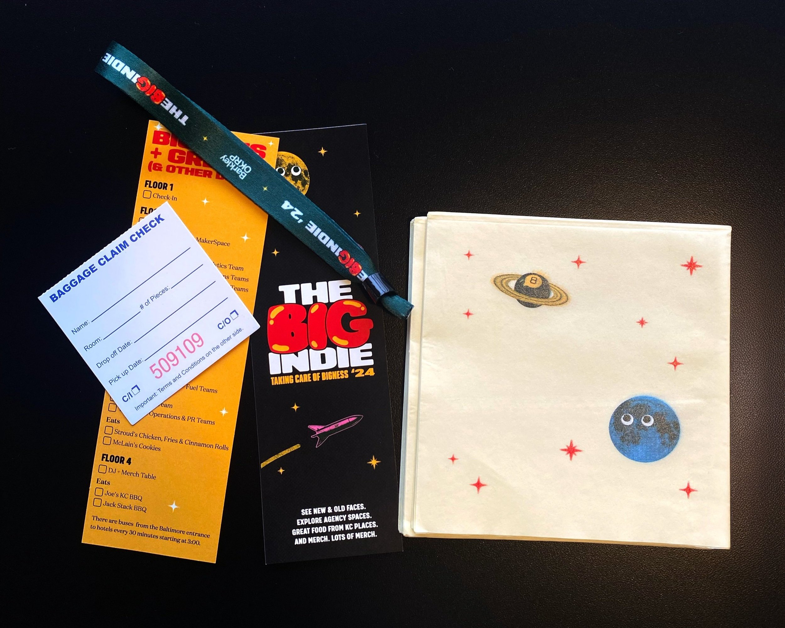


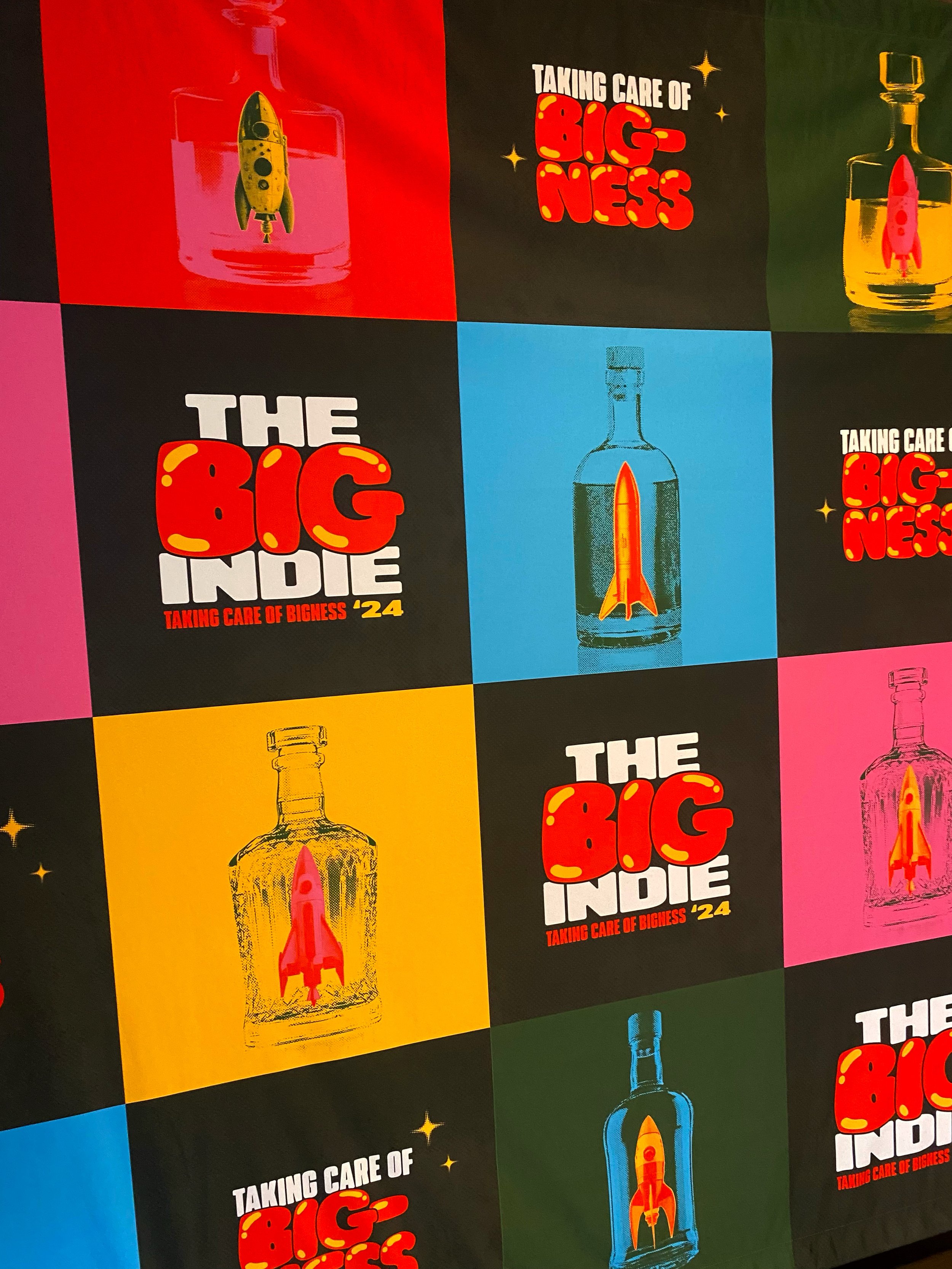

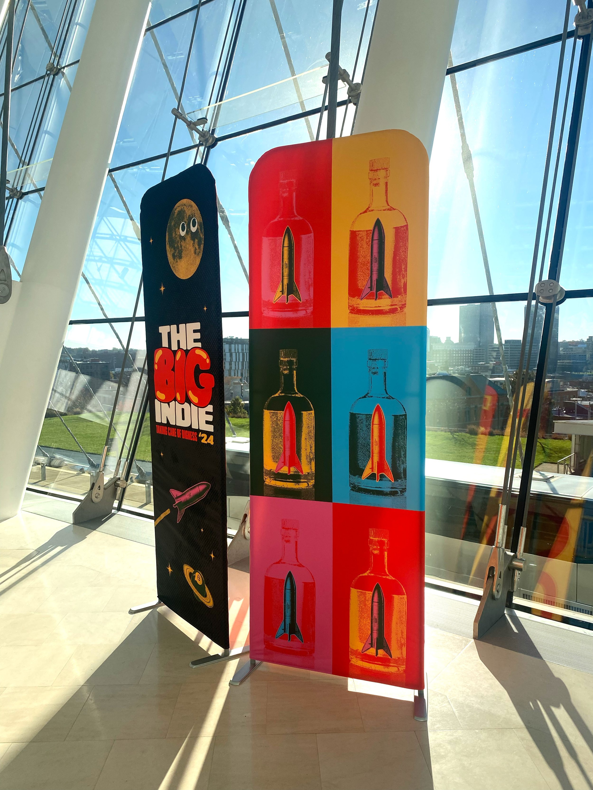

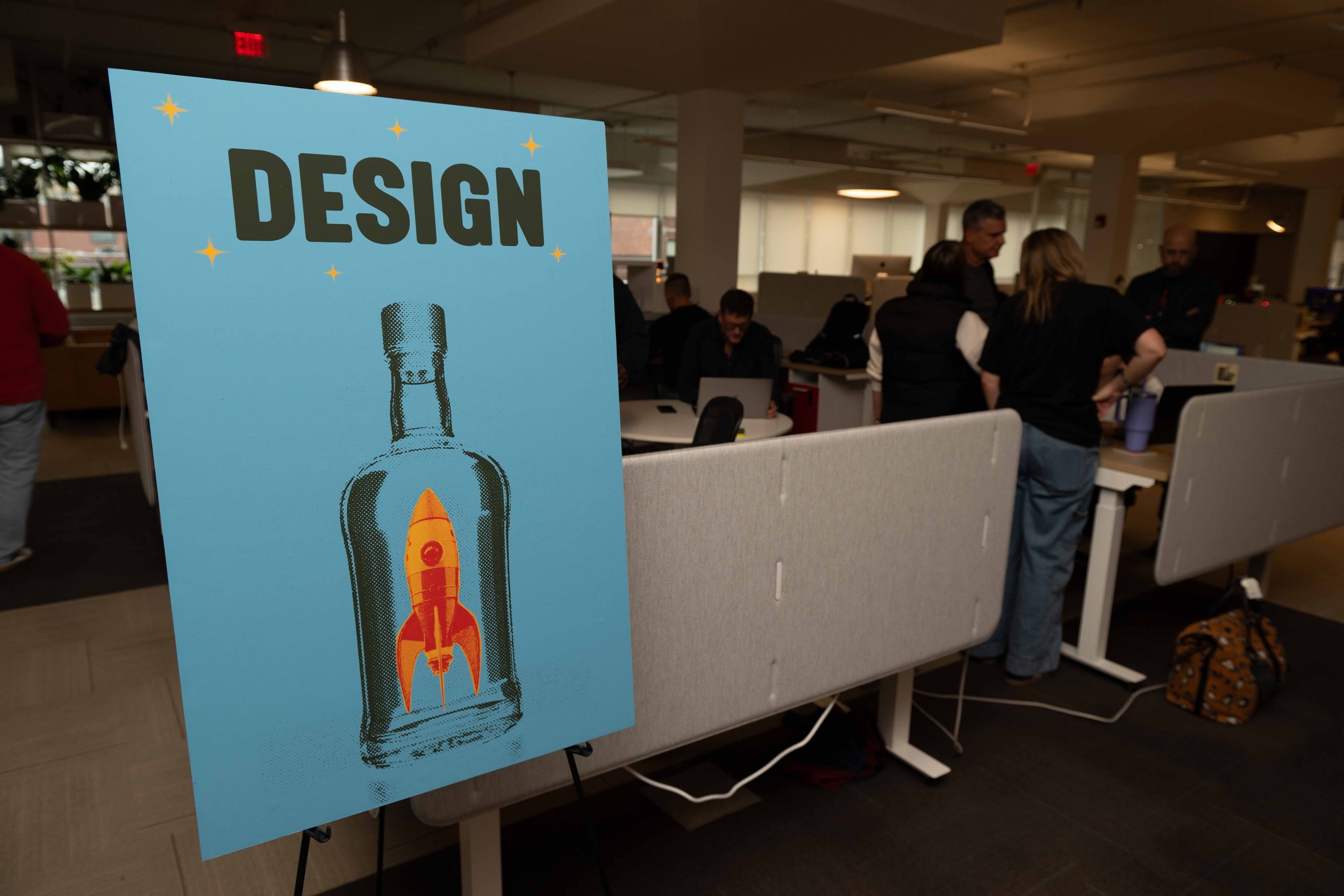

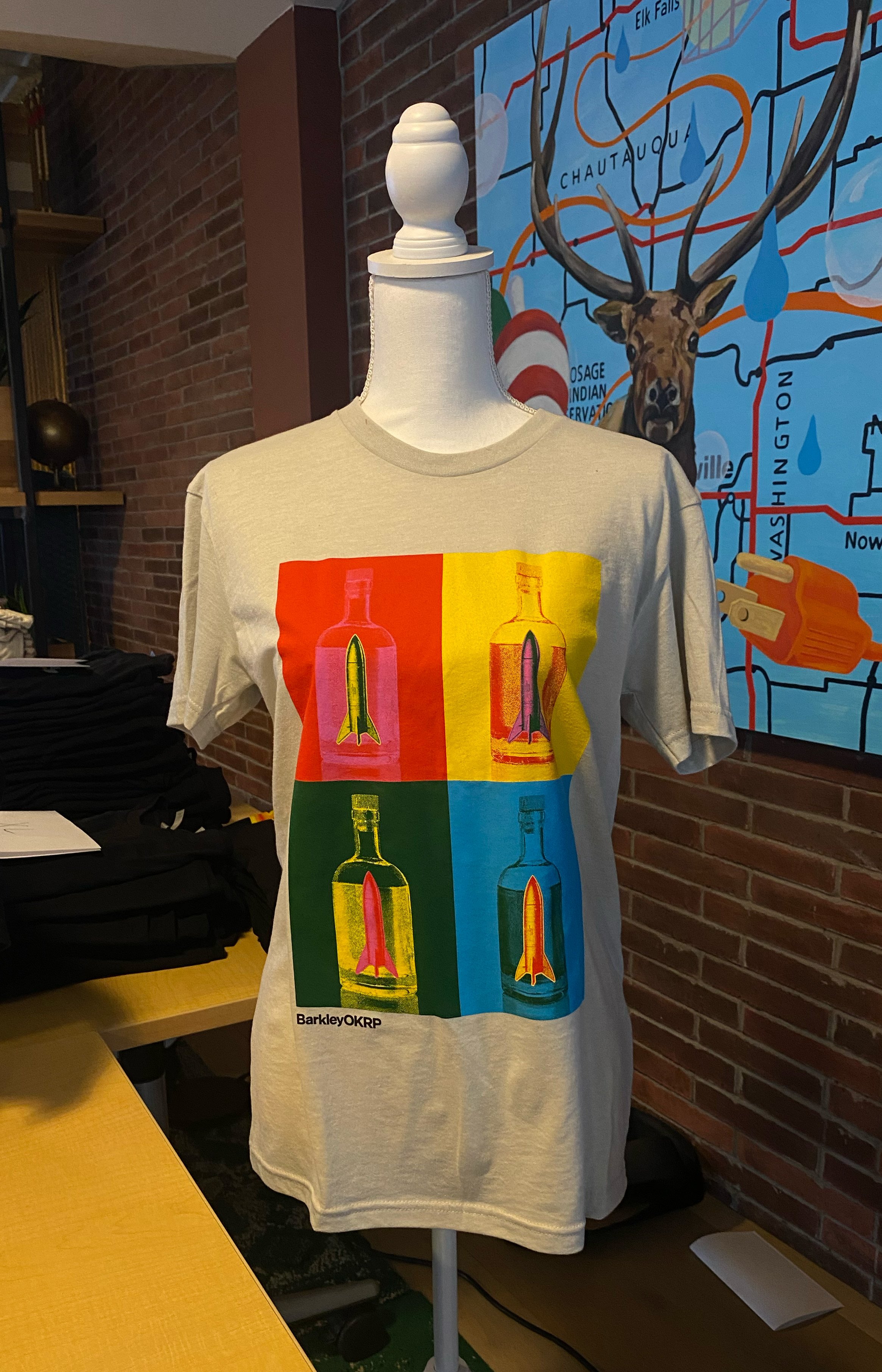

The whiskey bottle and rocket ship are both iconic and carry so much storytelling potential. Combining them not only showcases the identities of legacy OKRP and Barkley but also creates a unique, memorable visual metaphor for unity and collaboration.
It’s like blending history and vision—the bottle suggesting depth, craft, and tradition, while the rocket speaks to ambition, innovation, and forward motion.


